If you’ve ever stared at a spreadsheet full of numbers and thought, “There has to be a better way to understand this,” you’re not alone. I’ve been there—scrolling endlessly through rows and columns, trying to spot patterns that my brain just couldn’t see fast enough. That frustration is exactly where Tableau enters the picture. Data Visualization has become one of the most trusted and widely used data visualization tools in the world because it turns raw data into something humans can actually understand at a glance.
Tableau matters today more than ever because data is everywhere. Businesses, bloggers, marketers, analysts, students, and even small shop owners are collecting more information than they know what to do with. Knowing how to analyze and present that data isn’t a “nice-to-have” skill anymore; it’s a career-defining advantage. Data Visualization bridges the gap between complex data and clear decision-making, without requiring you to be a hardcore programmer.
In this guide, you’ll learn exactly what Tableau is, how it works, and why it’s so powerful. We’ll walk through real-world use cases, a step-by-step beginner workflow, tool comparisons, common mistakes, and expert tips I’ve learned through hands-on experience. Whether you’re just getting started or looking to level up, this article is designed to give you clarity, confidence, and practical direction.
What Is Tableau and Why Does Tableau Matter Today
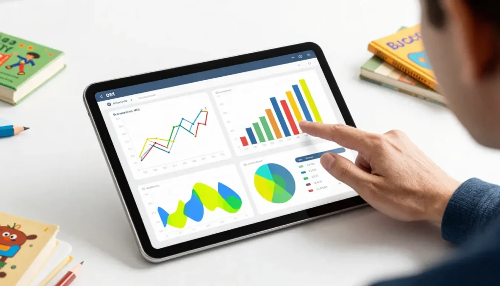
Tableau is a data visualization and business intelligence platform that helps you connect to data, analyze it visually, and share insights through interactive dashboards and reports. Think of it as a translator between data and human understanding. Instead of reading numbers, you see trends, outliers, and relationships through charts, maps, and graphs.
To explain Data Visualization in simple terms, imagine your data is a massive jigsaw puzzle dumped onto a table. You technically have all the pieces, but without a picture on the box, it’s hard to see what you’re building. Tableau gives you that picture. It lets you drag, drop, filter, and explore data until the story becomes clear.
What makes Tableau especially relevant today is speed and accessibility. Traditional reporting often involves waiting days or weeks for analysts to produce static reports. Data Visualization empowers users to explore data themselves, ask better questions, and get answers instantly. You don’t need to write long SQL queries to start seeing insights, although advanced users can go deep when needed.
In a world where decisions are increasingly data-driven, Tableau helps organizations move from guesswork to evidence-based action. That’s why it’s used by startups, Fortune 500 companies, journalists, researchers, and governments alike.
How Data Visualization Works Under the Hood (Beginner-Friendly Explanation)
At its core, Tableau works by connecting to your data source, creating a visual layer on top of it, and allowing you to interact with that data dynamically. The magic happens through something Tableau calls a “visual query language.” Instead of writing code, you build queries by dragging fields into rows, columns, filters, and marks.
Here’s a relatable way to think about it. Imagine organizing your wardrobe. You don’t think in code; you think in categories like shirts, pants, colors, and seasons. Data Visualization works the same way. You drag “Sales” here, “Date” there, and suddenly you’re looking at monthly trends without writing a single formula.
Tableau connects to many data sources, including Excel files, Google Sheets, SQL databases, cloud platforms, and even live APIs. Once connected, it extracts or queries the data and stores metadata about fields like dimensions and measures. Dimensions are descriptive fields such as names, dates, or categories. Measures are numerical fields like revenue, profit, or quantity.
The interface is built for exploration. You can start with a simple chart and gradually refine it by adding filters, calculations, or interactive elements. Tableau encourages curiosity, which is why many users discover insights they weren’t even looking for.
Benefits and Real-World Use Cases of Tableau
One of the biggest benefits of Tableau is how quickly it turns confusion into clarity. Instead of guessing what’s happening in your data, you can see it. Patterns that would take hours to uncover in spreadsheets become obvious in seconds.
For businesses, Tableau is often used to track performance metrics like sales, customer behavior, and operational efficiency. A sales manager might use Data Visualization to identify which regions are underperforming. A marketing team might analyze campaign performance across channels. Executives use dashboards to monitor KPIs in real time.
Tableau is also incredibly valuable outside traditional business roles. Content creators use it to analyze traffic trends. Journalists use it to tell data-driven stories. Educators use it to teach statistics visually. Healthcare professionals track patient outcomes. Nonprofits use it to measure impact and allocate resources effectively.
Another major advantage is collaboration. Tableau dashboards can be shared securely across teams, embedded in websites, or published to Tableau Server or Data Visualization Cloud. This ensures everyone is looking at the same data and drawing insights from a single source of truth.
Ultimately, Tableau is best suited for anyone who needs to make sense of data quickly and communicate insights clearly. If your work involves decisions, strategy, or storytelling with data, Tableau can be a game-changer.
Step-by-Step Guide: Getting Started with Tableau the Right Way
Starting with Tableau doesn’t have to be overwhelming. The key is to follow a structured approach rather than trying to learn everything at once. Here’s a practical, beginner-friendly workflow that mirrors how professionals actually use Tableau.
First, define your question. Before opening Tableau, ask yourself what you want to learn. Are you analyzing sales trends, user behavior, or performance over time? A clear question keeps you focused and prevents dashboard clutter.
Second, connect to your data. Data Visualization makes this simple. Open Tableau Desktop or Tableau Public, choose your data source, and verify that fields are correctly categorized as dimensions or measures. This step is crucial because incorrect data types can lead to misleading visuals.
Third, build a basic visualization. Start simple. Drag one dimension and one measure into the workspace and choose a chart type that fits your question. Bar charts are great for comparisons, line charts for trends, and maps for geographic data.
Fourth, refine and explore. Add filters, sort data, and create calculated fields if needed. This is where Data Visualization shines. You can ask “what if” questions and instantly see the results.
Finally, create a dashboard and share it. Combine multiple visuals into a single dashboard, add interactivity like filters and actions, and publish it. A good dashboard tells a clear story without overwhelming the viewer.
Best practices include keeping dashboards focused, using consistent colors, and always labeling axes clearly. Tableau rewards simplicity and clarity.
Tableau Tools, Editions, and Honest Comparisons
Tableau isn’t a single product; it’s an ecosystem of tools designed for different needs. Understanding these options helps you choose the right setup without overspending or underutilizing features.
Tableau Desktop is the flagship product. It’s a powerful tool for creating dashboards and performing deep analysis. This is what most professionals use for day-to-day work. Data Visualization Public is a free version that allows you to publish visualizations publicly, making it great for learning, portfolios, and bloggers.
Tableau Server and Tableau Cloud are used for sharing dashboards within organizations. Server is hosted on-premise, while Cloud is fully managed by Tableau. Both enable collaboration, governance, and secure access.
When comparing Tableau to alternatives like Power BI, Looker, or Google Data Studio, Data Visualization stands out for its flexibility and visual depth. Power BI may be more affordable for Microsoft-centric teams, while Google Data Studio is appealing for simple, free reporting. Tableau, however, offers unmatched visual customization and performance with large datasets.
The downside is cost. Tableau can be expensive for small teams. However, the return on investment often justifies the price when data-driven decisions lead to better outcomes.
Common Tableau Mistakes and How to Fix Them
One of the most common mistakes beginners make is trying to build overly complex dashboards. More charts do not equal more insight. In fact, clutter often hides the most important message. The fix is to focus on one core question per dashboard.
Another frequent issue is ignoring data preparation. Tableau is powerful, but it’s not magic. Poor data quality leads to poor insights. Always clean and validate your data before analysis. Simple steps like removing duplicates and standardizing formats can make a huge difference.
Performance problems are also common, especially with large datasets. Users often blame Tableau when the real issue is inefficient calculations or unoptimized data sources. Using extracts instead of live connections and minimizing complex calculations can significantly improve performance.
Finally, many users underestimate the importance of storytelling. A dashboard without context can confuse viewers. Use titles, annotations, and logical layout to guide the audience through your insights.
Avoiding these mistakes early will save you time and help you build trust in your work.
Advanced Tips for Using Tableau Like a Pro
Once you’re comfortable with the basics, Tableau offers advanced features that can elevate your analysis. Calculated fields allow you to create custom metrics tailored to your business logic. Parameters let users interact with data dynamically, changing views without editing the dashboard.
Level of Detail expressions are another powerful feature. They allow you to control aggregation levels precisely, solving complex analytical problems that traditional charts can’t handle easily.
Performance tuning is also an advanced skill worth learning. Understanding how Tableau processes queries helps you design faster dashboards. This includes using extracts wisely, reducing unnecessary filters, and optimizing calculations.
Lastly, keep learning from the community. Tableau has one of the most active user communities in data analytics. Blogs, forums, and user groups are goldmines of practical advice and inspiration.
For visual learners, this beginner-friendly overview video is a great complement to hands-on practice:
Conclusion
Tableau is more than just a data visualization tool; it’s a way of thinking about data. It helps you move from numbers to narratives, from confusion to clarity. Whether you’re analyzing business performance, telling stories with data, or building a career in analytics, Tableau gives you the tools to do it effectively.
The real power of Tableau lies in how approachable it is. You don’t need to be a technical expert to start, but the platform grows with you as your skills advance. By focusing on clear questions, clean data, and thoughtful design, you can create dashboards that inform, persuade, and inspire action.
If you’ve been on the fence about learning Tableau, this is your sign to start. Download a free version, explore a dataset you care about, and see how quickly insights emerge. And if you have questions or experiences to share, join the conversation—data is always better when it’s shared.
FAQs
What is Tableau used for?
Tableau is used for data visualization, analysis, and business intelligence. It helps users explore data visually and share insights through dashboards.
Is Tableau hard to learn for beginners?
Tableau is beginner-friendly thanks to its drag-and-drop interface. Most users can create basic visualizations within their first day.
Do I need coding skills to use Tableau?
No coding is required for most Tableau tasks. Advanced users may use SQL or calculations, but beginners can get great results without code.
Is Tableau better than Excel?
Tableau and Excel serve different purposes. Excel is great for data entry and calculations, while Tableau excels at visual analysis and dashboards.
Can Tableau handle big data
Yes, Tableau is designed to work with large datasets and integrates with many big data platforms.
Adrian Cole is a technology researcher and AI content specialist with more than seven years of experience studying automation, machine learning models, and digital innovation. He has worked with multiple tech startups as a consultant, helping them adopt smarter tools and build data-driven systems. Adrian writes simple, clear, and practical explanations of complex tech topics so readers can easily understand the future of AI.